Styling the Buttons on the Edit Entry Page
Note: For an in-depth tutorial, including CSS examples, see our blog post How to Style the Buttons on GravityView's Edit Entry Page.
The Edit Entry page contains three buttons - “Update”, “Cancel” and “Delete”. These buttons may inherit styles from your theme or display as plain HTML.
Either way, you can override the default styling by targeting the button classes with your own custom CSS. If you don’t know how to add custom CSS to your website, read Adding custom CSS to your website.
Identifying the Button Classes
The buttons on the Edit Entry page are contained within a <div> tag with an ID of #publishing-action. The button classes themselves are as follows:
- Update:
.gv-button-update - Cancel:
.gv-button-cancel - Delete:
.gv-button-delete
Note: For information regarding HTML elements and CSS classes in GravityView, see our CSS Guide.
Writing Custom CSS
You can use the ID of the containing <div> and the button class to target a specific button with CSS. For example, this is how you would style the “Update” button.
#publishing-action .gv-button-update { // your CSS code here }
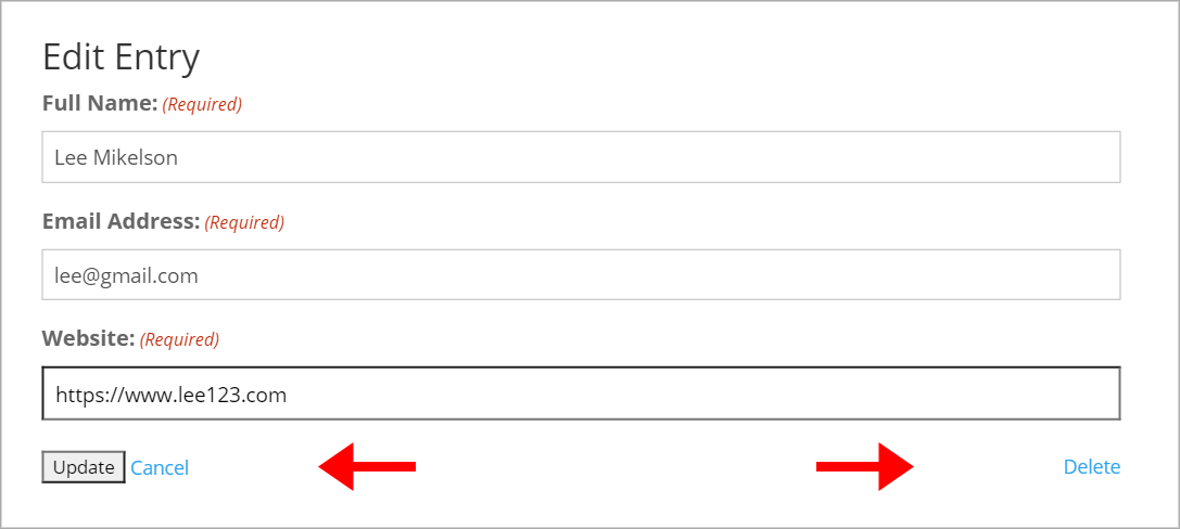
Buttons without any styles applied (Divi theme):

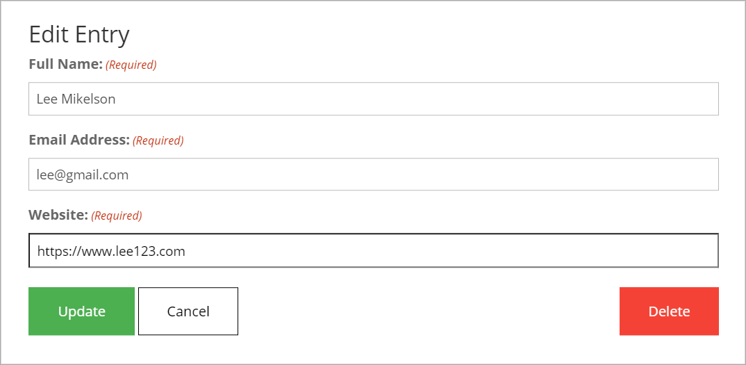
Buttons after applying custom styles:

You can add hover styles to your buttons by using the CSS :hover selector. This allows you to change the look of an element when the user mouses over it. Here’s how you would add hover styles to the “Cancel” button:
#publishing-action .gv-button-cancel:hover { background-color: #f3f3f3; }
Targeting Specific Forms
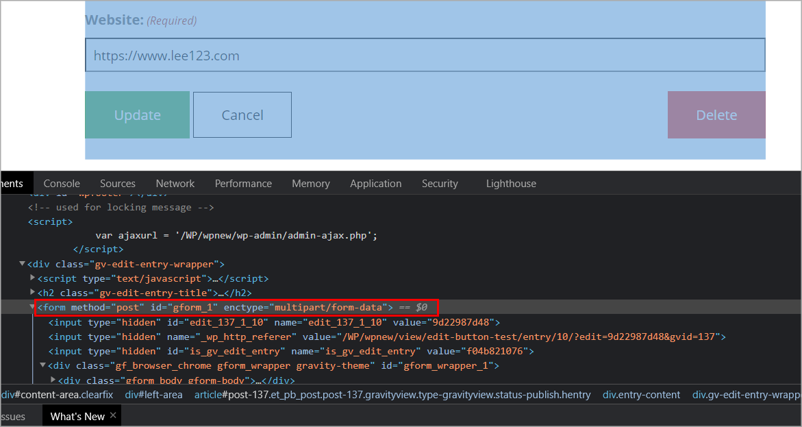
The above CSS examples will change the button styles for every View that you create. If you want to style the buttons differently for each View, you can do so by targeting the ID of the outer <form> element.

For example, if the form linked to your View has an ID of “3”, your CSS would look like this:
#gform_3 #publishing-action .gv-button-cancel { background-color: #fff; border: 1px solid #000; }
Note: Targeting #gform_[ID] will change the button styles for each View linked to that form. In other words, if you have multiple Views linked to the same form, their button styles will look the same.
Example Styles
#publishing-action{
	width: 100%;
}

/* Update button */
#publishing-action .gv-button-update {
	background-color: #4CAF50;
  	border: 2px solid #4CAF50;
  	color: #ffffff;
  	padding: 15px 32px;
  	text-align: center;
  	font-size: 16px;
}

#publishing-action .gv-button-update:hover {
	background-color: #46a04a;
	border: 2px solid #46a04a;
	cursor: pointer;
}

/* Cancel button */
#publishing-action .gv-button-cancel {
background-color: #fff;
  	border: 1px solid #000;
  	color: #000000;
  	padding: 15px 32px;
  	text-align: center;
  	text-decoration: none;
  	font-size: 16px;
}

#publishing-action .gv-button-cancel:hover {
	background-color: #f3f3f3;
}

/* Delete button */
#publishing-action .gv-button-delete {
background-color: #F44336;
  	border: 1px solid #F44336;
  	color: #ffffff;
  	padding: 15px 32px;
  	text-align: center;
  	text-decoration: none;
  	font-size: 16px;
}

#publishing-action .gv-button-delete:hover {
	background-color: #f21c0d;
	border: 1px solid #F44336;
}
Read here how to add these CSS samples to your website: Adding custom CSS to your website
_1@2x.png)