_1@2x.png)
Differences Between Chart Types in GravityCharts
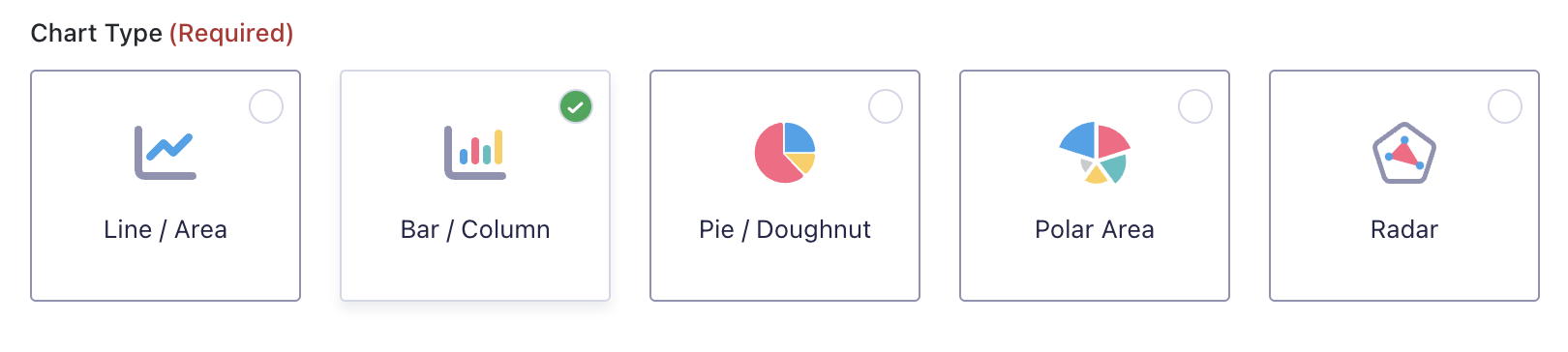
When creating a new chart, you’ll need to choose a chart type. There are five available chart types:
- Line/Area
- Bar/Column
- Pie/Doughnut
- Polar Area
- Radar
The chart type you choose will depend on the data you’re working with and your preference for visualizing that data. Here’s a brief overview of each of the five available chart types:
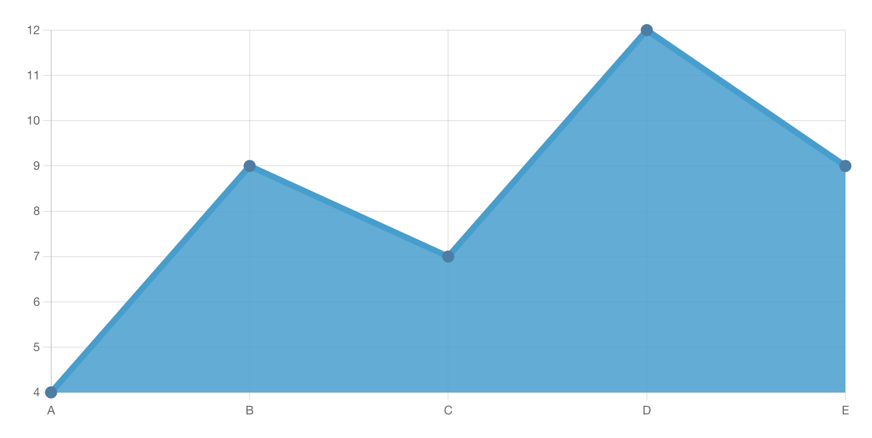
Line/area
A line chart is a type of graph that displays data as a series of points connected by straight line segments. This is a primary chart type that is commonly used in many different fields.
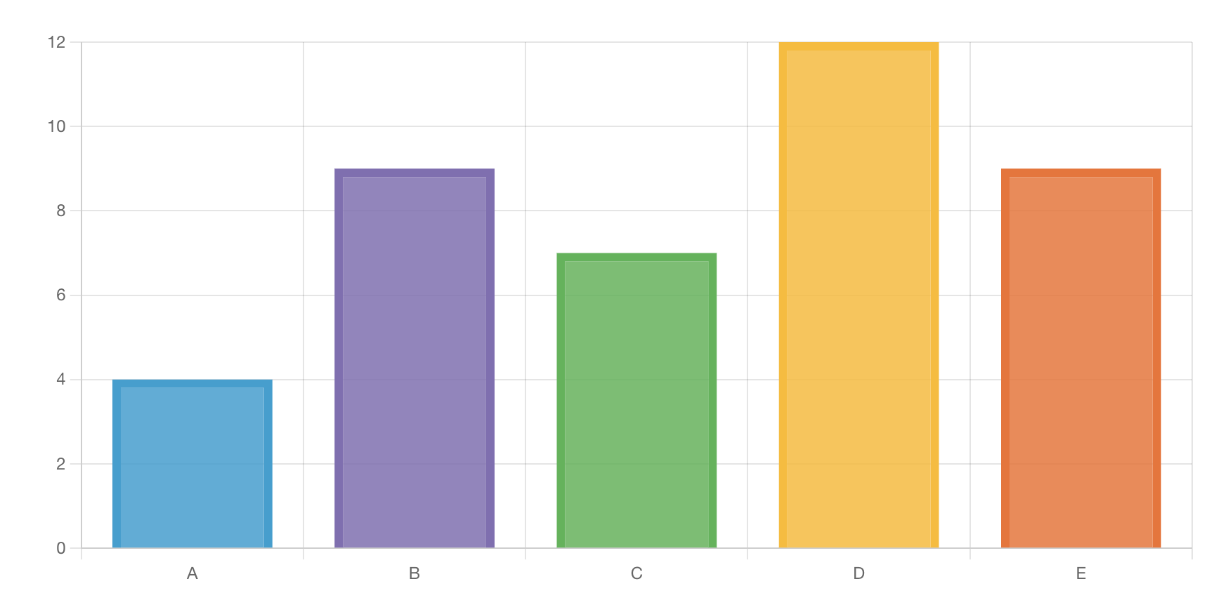
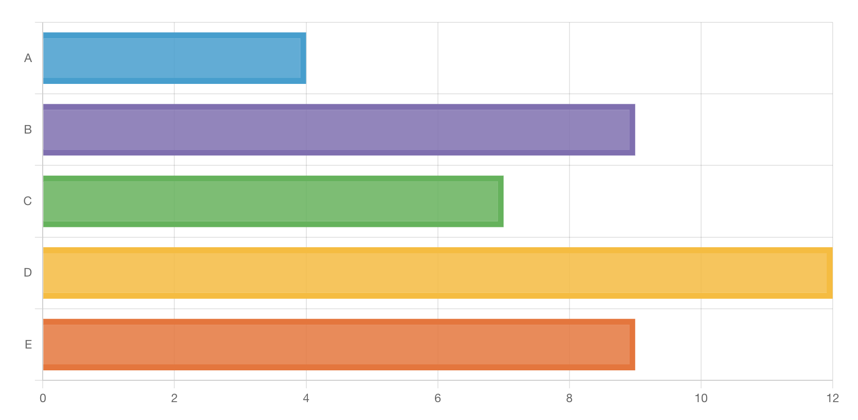
Bar/column
A bar chart is a type of graph that represents categorical data with rectangular bars. The heights/widths of the bars are proportional to the values they represent.
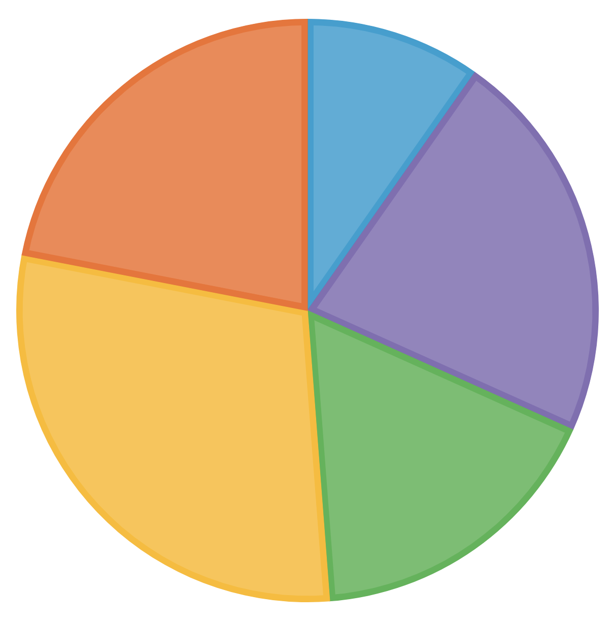
Pie/doughnut
A pie chart is a circular graphic, divided into “slices” that each represents categorical data as a proportion of the whole. A doughnut chart is the same, except it has a hole in the middle.

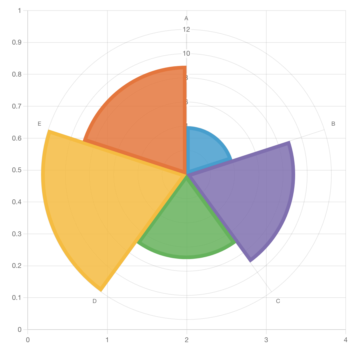
Polar area
Polar area charts are similar to pie charts, but each segment has the same angle. With polar area charts, it is the radius of each area that differs to reflect its value.
Radar
A radar chart is a method for displaying multivariate data on a 2-dimensional set of axes that start from the same point.
