_1@2x.png)
Getting started with the Advanced Elementor Widget for GravityView
The GravityView Elementor styler brings the power of visual styling to your Views. Instead of writing custom CSS or navigating through multiple settings panels, you can now style your Views directly in Elementor's intuitive interface. This article explains how to get started and create a beautiful, custom-styled View in just a few minutes.
Prerequisites
Before you begin, make sure you have:
- GravityView installed and activated
- Elementor (free or Pro) installed and activated
- At least one View already created in GravityView
Note: If you haven’t created a View yet, see Creating a View before continuing.
Prefer to watch the video?
In this video, Casey gives a live demo on embedding and styling a View inside Elementor.
Adding a View to your Elementor page
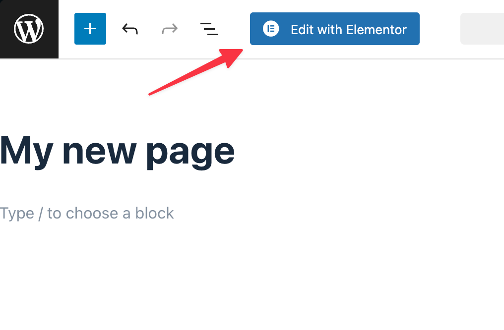
Step 1: Create or edit a page
First, navigate to Pages in your WordPress dashboard and either create a new page or edit an existing one. Click the Edit with Elementor button to open the Elementor visual builder.
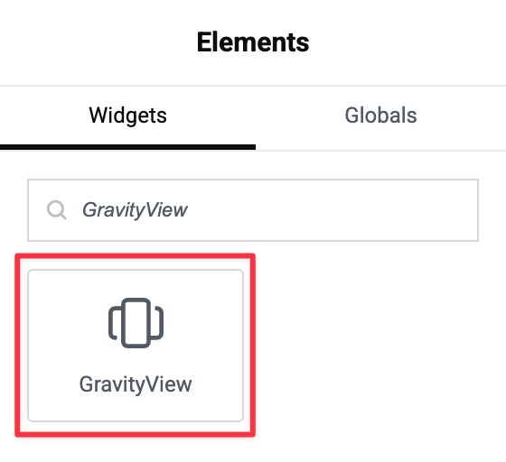
Step 2: Find the GravityView widget
In the Elementor sidebar, use the search box to find the GravityView widget. Simply type "view" and you'll see the GravityView widget appear.
Drag and drop the widget into your page layout wherever you want your View to appear.
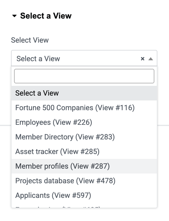
Step 3: Select your View
Once you've added the widget, you'll see a dropdown menu in the widget settings. Click the dropdown and select which View you want to embed on the page.
Step 4: Configure View settings (optional)
In the Content tab, you'll find all the settings available in the standard GravityView shortcode. You can customize options like:
- Allow User Edits
- Entries per page
- Search settings
- Sort options
These settings can be adjusted directly in Elementor without leaving the visual builder.
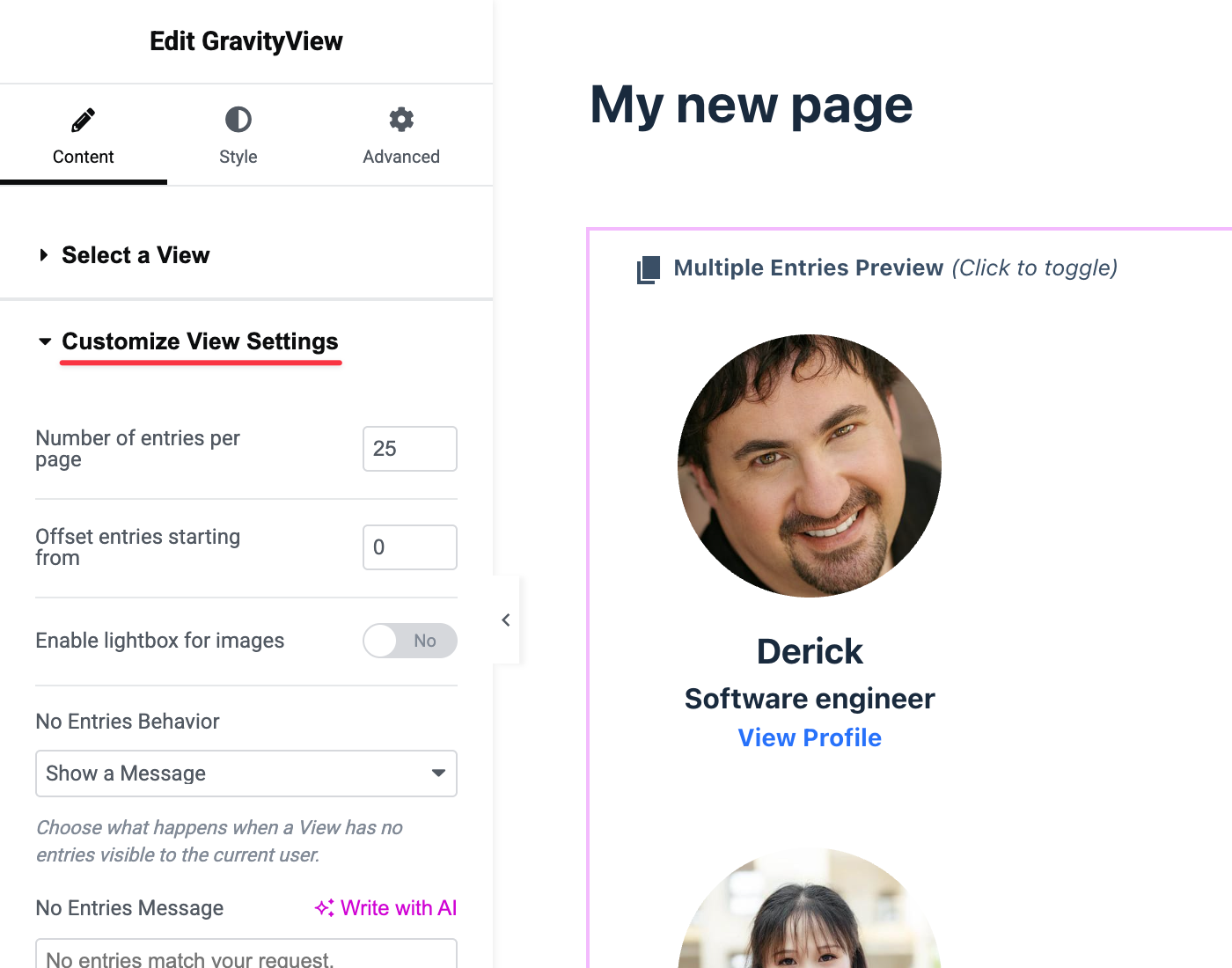
Styling your View
This is where the real magic happens. The Style tab gives you granular control over every aspect of your View's appearance.
Understanding the style options
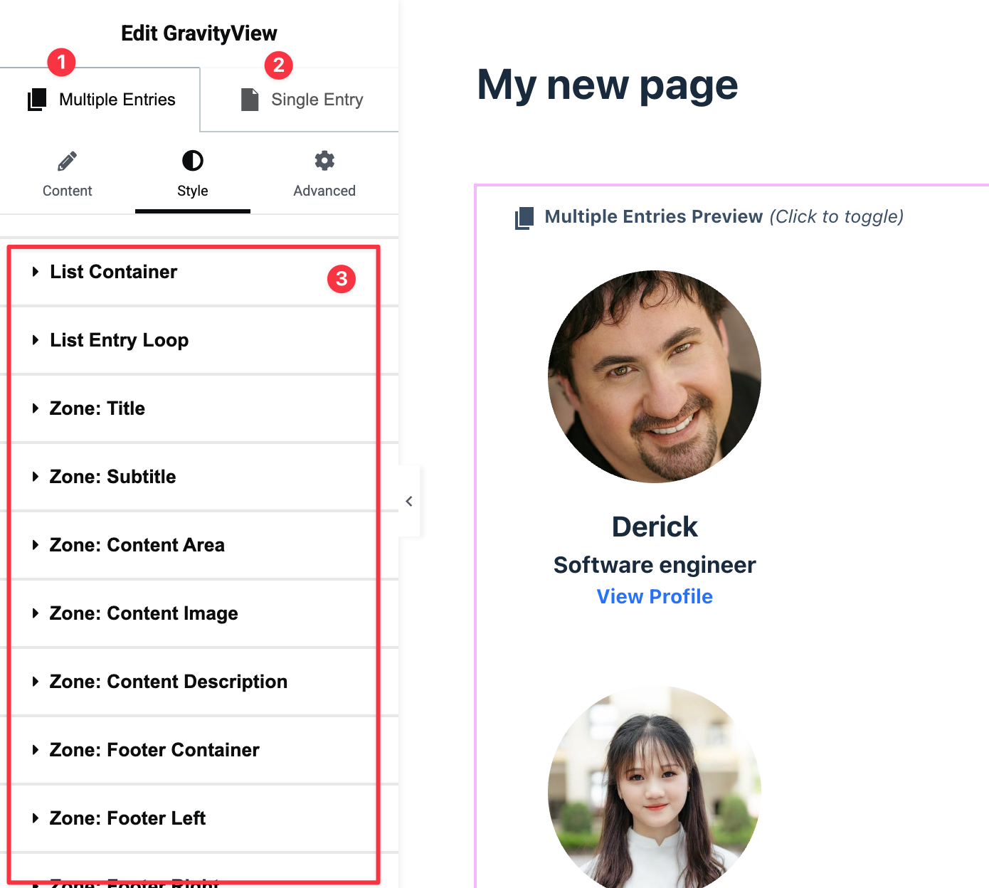
1) and 2) You can switch between the Multiple Entries and Single Entry pages using the tabs at the top. These pages have separate styling options.
3) When you click the Style tab, you'll see multiple sections that correspond to different areas of your View (these will be different depending on the layout that your View is using), for example:
- Container - The outer wrapper of your View
- Entry Loop - The repeating entry cards or rows
- Field Zones - Individual areas where your fields are displayed
Pro Tip: Hover over any section in the Style tab to see it highlighted on your View. This makes it easy to identify which set of style options affect which elements. You can also click directly on any element in the preview to automatically open its corresponding style options.
Text colors
The text color follows a cascading hierarchy, similar to CSS. When you set the text color at the container level, it applies to everything inside. You can then override it for specific elements by adjusting the text color in more specific settings like Field Values or individual Field Zones.
Responsive controls
Your View should look great on all devices. Elementor makes this easy with built in responsive controls. At the top of the Elementor interface, you'll see device icons (desktop, tablet, mobile). Click on the mobile icon to preview how your View looks on smaller screens.
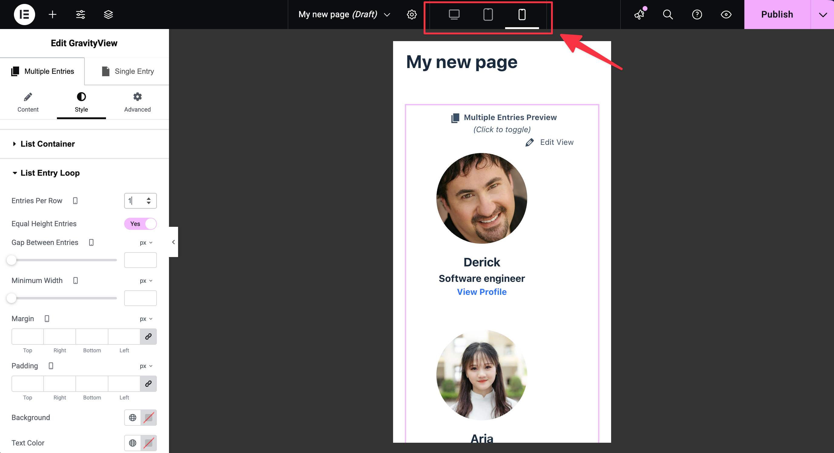
For example, on mobile devices, you might want to adjust:
- Entries per row - Set to 1 for a single-column layout on mobile
- Padding and spacing - Reduce padding to maximize screen space
- Font sizes - Adjust text sizes for better readability
Each device size can have its own styles, ensuring your View looks perfect everywhere.
Supported layouts
The GravityView Elementor widget supports most GravityView layouts:
| Layout | Supported |
| List | ✓ Yes |
| Table | ✓ Yes |
| Layout Builder | ✓ Yes |
| Maps | ✓ Yes (with live maps replaced by placeholder) |
| DIY | ✓ Yes |
| DataTables | Coming soon |
Each layout has its own unique style options tailored to its structure.
Tips for Success
- Start simple: Begin with basic styling like colors and spacing before diving into advanced customizations.
- Use the hover preview: The hover functionality is incredibly helpful for identifying which style setting controls which element.
- Think mobile-first: Always check how your View looks on mobile devices and adjust accordingly.
- Leverage Elementor's tools: Don't forget about Elementor's global colors and typography settings, which can help maintain consistency across your site.
- No CSS required: Everything can be done visually through the interface. If you find yourself thinking "I need to write CSS for this," explore the style options first—the setting you need is likely already there.
Next steps
Now that you know the basics, experiment with different styles and layouts. The combination of GravityView's powerful data display capabilities and Elementor's visual design tools opens up endless possibilities for creating beautiful, functional web applications.